As soon as a break through app, Opera mini lands, I find it exciting in both:
- browsers war happens in iPhone, too
- it is VERY FAST
I am not going to write a user level review, but from developer/technical point of view. Starting from least mentioned in media:
2 zoom levels only

You may not discovered that, opera just have 2 zoom level, a overview and closed view. You may not discover because it calculates the zoom level so actuate, and you barely need a third zoom level. Try it yourself!
I am neutral about this implementation, as far as it calculates correctly over 99% of webpage. But I have a wild guess from this observation, that it is the critical point that made opera so fast, by only saving 2 static image.
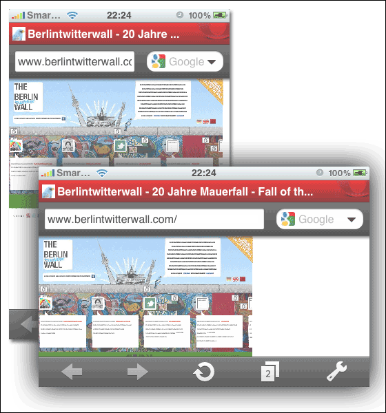
This wild guess can be further prove by looking at some "auto changing" sites, like http://berlintwitterwall.com. In normal browser(even in iPhone's safari, although very slow), this site scroll horizontally and popping new tweets, while in opera, the site is static.
vertical/horizontal switching do not render page again
In iPhone's safari, by flipping the phone vertically and horizontally, the page render again to fit the monitor width. This also do not apply to opera. you will see a large white space if you flip from horizontal to vertical position. But if you reload the page, the page will render again and fit your phone's orientation.

If my guess is correct, I even have a wilder guess that the 2 static image may actually render on opera's server, not on the iPhone. and Changing orientation do not trigger another request/do not render the page again!
overflow:auto

This is another side evidence that opera mini is actually showing a static image, but not just "ignoring continuous javascript". Many sites define a finite height of a div. By applying a css property "overflow:auto", if the content within the div is actually having a height larger than the defined value, a scroll bar take place. http://inmediahk.net on the right sidebar had an example. In opera, the scroll bar do not appear again. (similar behavior with overflow:hidden)(This actually also apply to safari)
alternative rendering logic for zoom level fitting

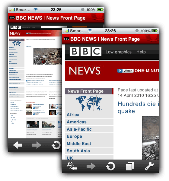
The images best explain what I want to say. The rendering logic align image and text to the same width so in closer level zooming, the image and text will fit the screen beautifully. (sorry no guess here ^^)

super fast tabbed browsing, bandwidth saving
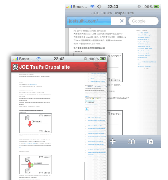
Also no special observation here, but above 2 points worth mention again. The switching between tabs in super fast, like desktop speed! (maybe because just switching 2 image?). And bandwidth saving by opera turbo is a famous function of opera, even in desktop version.
user-friendly-ness (speed dial setup)
lastly, an improvement needed. Setting up the 9 speed dials is very difficult through UI. You cannot save the current page as speed dial, but you have to open a new speed dial tab, and press the thumbnail and type the URL to edit it.....
