Educationpost.com.hk
Technical Highlights:
- Deeply integrated with apache solr with extra custom indexes.
- Empower solr for rich auto complete widgets and course alert subscriptions content.
- Finely crafted workflow for selected external customers to publish UGC.
Others
- Worked with 2 vendors to develop the site simultaneously to deliver in a very short period of time


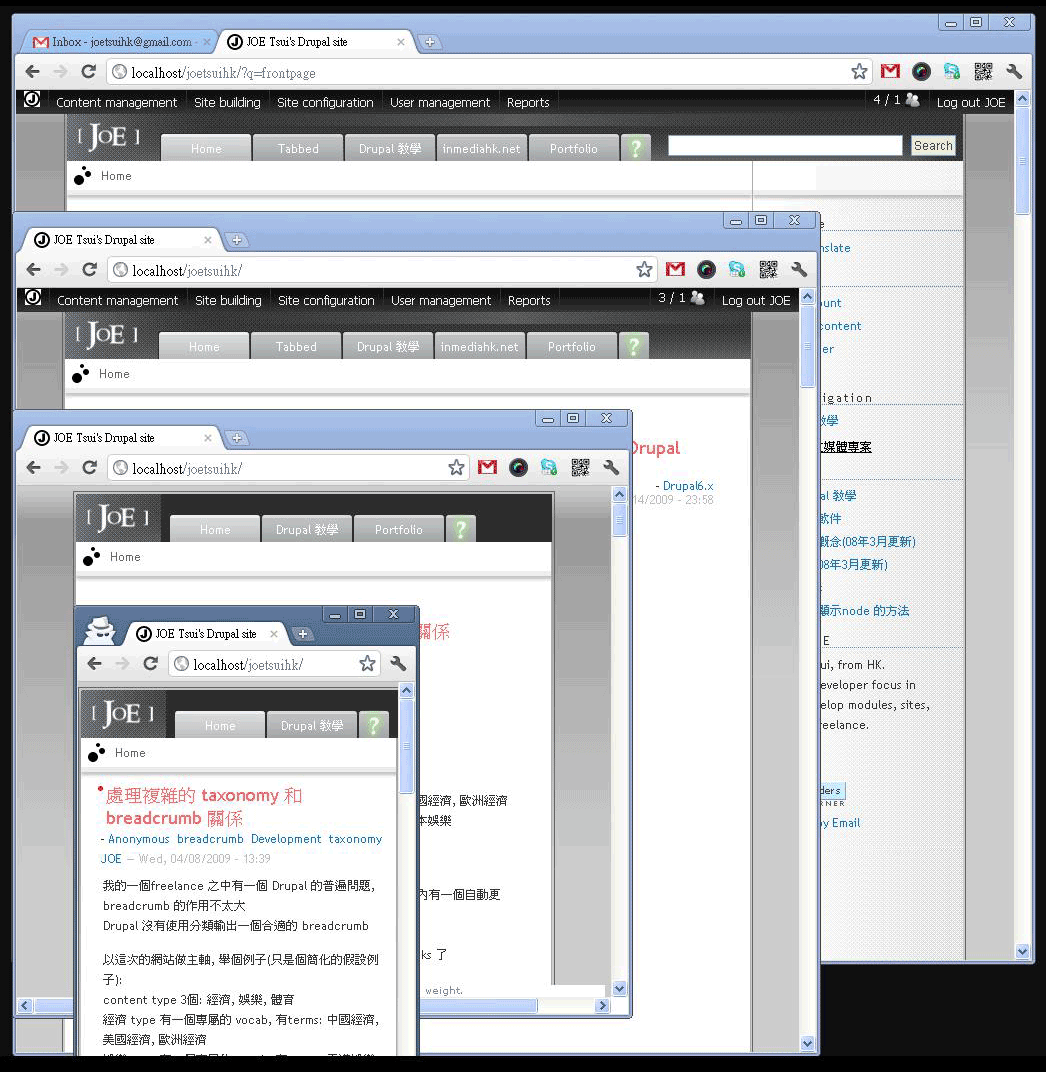
Development Tips: strip html tags on Drupal like view's doing
Views 的 fields 輸出項目有一個很方便的功能
它可以指定輸出一大段文字中的首 x 個字符
輸出 body 的時候可以大約控制欄位的長闊
實作原來是使用了 Drupal api:
http://api.drupal.org/api/drupal/modules--filter--filter.module/function...
因為 body 會自動插入 <p>
使用一般的 trim() 的話便會有 invalidate HTML 的問題
在 IE 上的版位便會變得更難控制了..
#IEhell
Drupal7 imagefield_extended 的代用品 replacement for imagefield_extended
D6 的 imagefield_extended是我一個常用的模組,
可以將數個文字欄位加到 image 上,
當 imagefield 本身是 unlimited 的時候很有用
但顯然這不是 D7 的做法
D7 的做法是原生的將多個欄位組合, 而不只是 image 和 text
可以 image 和 email, options 等等
http://drupal.org/project/field_collection
而現在的 dev version 有一個 bug,
要支持 imagefield 便要使用以下的 patch
http://drupal.org/node/1187010#comment-4947330
操作上,
先到 structure define "field-collections"
便可以建立一個 "包含數個 field 的 field"
然後像一般的欄位到 content type 的頁面設定便可以
Widget 選 "embedded"
Joetsuihk.com 為手機瀏覽提供最佳化 support various device by leveraging responsive web design
在 Drupal Camp Taipei 學到的一個技術, responsive web design
早就想要試試應用到我的 blog
最初是打算移除右欄, 然後覺得頁頂的導航欄都不需要那麼長
再修改一下留白的位置就完成了
整體來說只要你一直守著正確的, 語意化的 html的話
轉換應該是很簡單的
下面再有詳細的技術細節
Responsive web design learn from Drupal Camp Taipei, a tech that wanted to be applied to this blog since then. Aim: to support viewing articles on modern mobile/tablet devices. Starting with removing right sidebar, and then taken out a few top menu items, little spacing to work on smaller screens and that's it.
If you are following schematic design, the conversion should be very simple. More technical details below.
Responsive web design 指使用 css3 的 media queries 來針對不同的 screen size 使用不同的 css
可以想像 css 有 if else 判定
而且手機上的瀏覽器都是基於 webkit, 不需要擔心瀏覽器的問題
在 Drupal 上我建立了另一個 mobile.css 專門放 media queries:
/* execute when less than 902px*/
@media screen and (max-width:902px),
screen and (max-device-width:902px){
  #sidebar-right{
    display:none;
  }
}
/* execute when less than 689px*/
@media screen and (max-width:689px),
screen and (max-device-width:689px){
  body {
    width:480px;
  }
}
上面的 code 都很直觀, (max-device-width:689px) 就是media query 的部份(max-width:689px)是 desktop 縮少 window size 時用(max-device-width:689px)是 mobile device 時用到
最後, 要令 mobile device 顯示的時候不放大便要在 <head>:
<meta name="viewport" content="width=device-width; initial-scale=1.0;">Technically Responsive web design means using part of css3: media queries to pin point different screen size to use different css, just like having if else case in css. And as mobile device are all webkit based browsers, you do not need o worry about supporting thousands of browsers.
In Drupal, I add a mobile.css for new media queries CSS
/* execute when less than 902px*/
@media screen and (max-width:902px),
screen and (max-device-width:902px){
  #sidebar-right{
    display:none;
  }
}
/* execute when less than 689px*/
@media screen and (max-width:689px),
screen and (max-device-width:689px){
  body {
    width:480px;
  }
}
The above code is self-explanatory, (max-device-width:689px) is media query(max-width:689px)reacts on desktop with smaller window size(max-device-width:689px)reacts on mobile device width instead
Finally, to force disable mobile device zooming, in<head>:
<meta name="viewport" content="width=device-width; initial-scale=1.0;">| Attachment | Size |
|---|---|
 responsive-layout.png responsive-layout.png | 151.49 KB |
